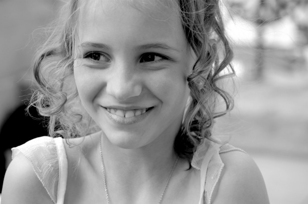
How would you know which photos to keep in colour and which ones to convert to sepia and black and white? As I’ve mentioned in my previous post, I decide on which photos to convert by instinct. Sometimes it just comes to me, at other times it is because I think the photo in colour is not good enough and trying out the photo in black and white or sepia usually makes it a better photo. By doing this I get more contrasts and often if not always, the impact and emotion of the photo changes. Some photos are just meant to be in black and white, and some in sepia. That is, during times when my instinct is right.
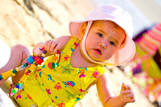
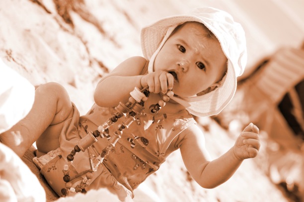
The photo below does not look right in colour; there are far too many bright colours vying for attention. A very similar photo looks just perfect in sepia.
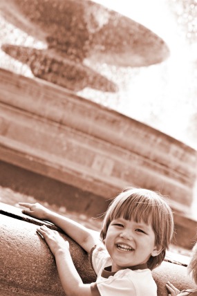
The photo of my little boy by the fountain was taken on a very bright sunny day and the shadows on his face were pretty harsh. The background was over-exposed with the water reflecting the intensity of the light. Converting this to sepia meant that I was able to easily even out the exposure and bring the primary focus towards my little boy in the foreground.
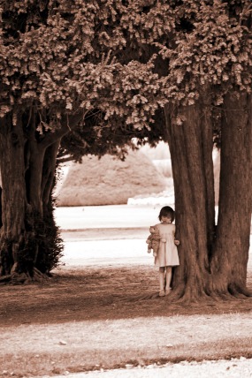
The photo of my little girl standing by the tree was taken on an cloudy day. She had been running around and took shelter under the tree when it suddenly rained. I happened to be on the opposite side of the road and took this shot quickly before she could run away. The colour photo was pretty dull with the big green trees dominating the frame. Converting to sepia changes the whole emotion of this photo and focus is drawn towards my little girl for a more emotional impact.
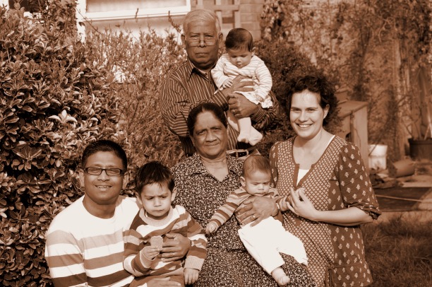
The family portrait at the bottom of this page looks best in sepia. The original colour photo had far too many clashing colours for a formal family shot. Converting it to sepia gave it a classic look and a stronger sense of unity.

I'm Lily, the girl behind the lens. I would love to tell your story through photographs. Contact me and let's make a plan.
share this post


