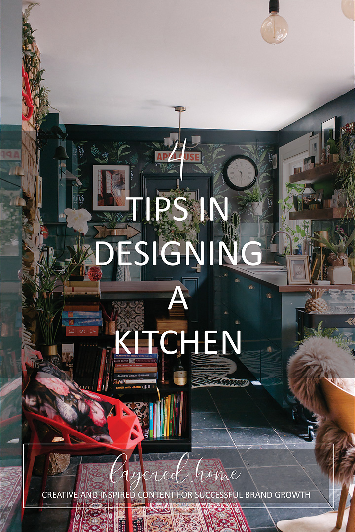
4 tips in designing a kitchen
Kitchens can be an overwhelming space to design. I certainly felt rather out of my depth when I decided to revamp my kitchen. It’s a huge undertaking more so because it’s often the hub in the home.
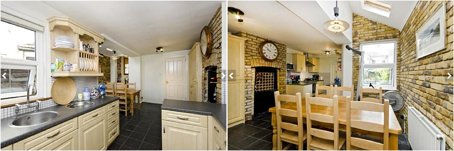
Above is the kitchen when we moved in 5 years ago. (Photo courtesy of the estate agent’s website)
Kitchens need to work hard and be a practical space as well as offer you that feeling of joy whilst being in it. Cooking is not my favourite job, it’s a chore for me, so having a kitchen I enjoy being in helps me get through it. And then there’s the issue of space. Not everyone is lucky enough to have big kitchens that can afford an island or a bar area with stools. My kitchen is certainly on the small side – something characteristic of a narrow Victorian home.
But I’m happy to say that I ended up with a kitchen I love. It also is my most popular space on Instagram. I thought I’d share the 4 tips I used to create it. By the way, don’t forget to download my free resources that will help you design your own interiors and grow your Instagram account!
1. Colour
There is an array of choices out there. Much like choosing from a menu offering a thousand dishes, choosing a colour scheme can be off-putting. I decided to keep my choices simple: do you want to go light or dark or a mixture of both? If it helps, write down your reasons under each choice. Once you have decided on whether light or dark or mixture, you can think of colours. I tend to be intuitive with this and go with what colours I like. My favourite colours. Those that make me happy for some reason I can’t exactly articulate.
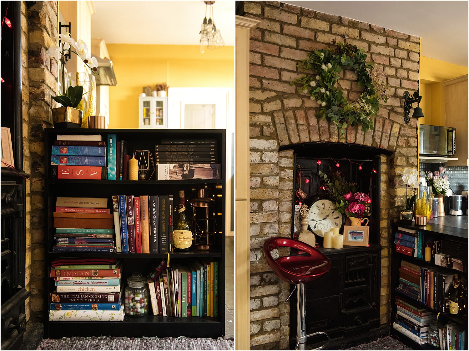
Before I went through this process, I painted my kitchen a mustard yellow (see below) thinking it’s such a dark kitchen that I want it to be sunny all the time! It didn’t really work. The yellow just turned into a dull dirty hue in such dim space. Worse was that the kitchen units were moulded melamine in yellow-beige colour. Altogether, it felt rather dingy. I must have disliked it so much I don’t have any proper pictures of the kitchen at that stage! Luckily, it’s only just paint and it’s not the end of the world if you get paint wall colour wrong.
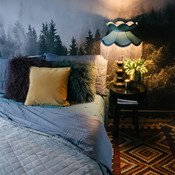
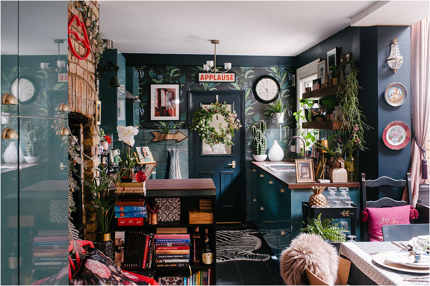
I decided to go for a cool blue kitchen with warm wood and gold touches to provide contrast. Experts such as Abigail Ahern in her book Colour suggests reigning in your colour palette to 3 or 4 maximum to keep everything cohesive. To me, that makes sense. I found deciding on the colour the hardest thing too. It was crucial for me to get the tile colour right and it took 50 different tile samples to get there!
2. Which star to feature
Even with 4 colours, you have to decide how they are going to work together. Prioritise what part of the kitchen, be it an appliance or a wall or fittings, to make a feature of. Do you want your tiles or splashback to be the main feature? Or is it the kitchen units? Lighting? Worktop? Appliances – like a pink Smeg fridge-freezer for example? I think there can only be one or two main stars in my kitchen. The rest are supporting stars.
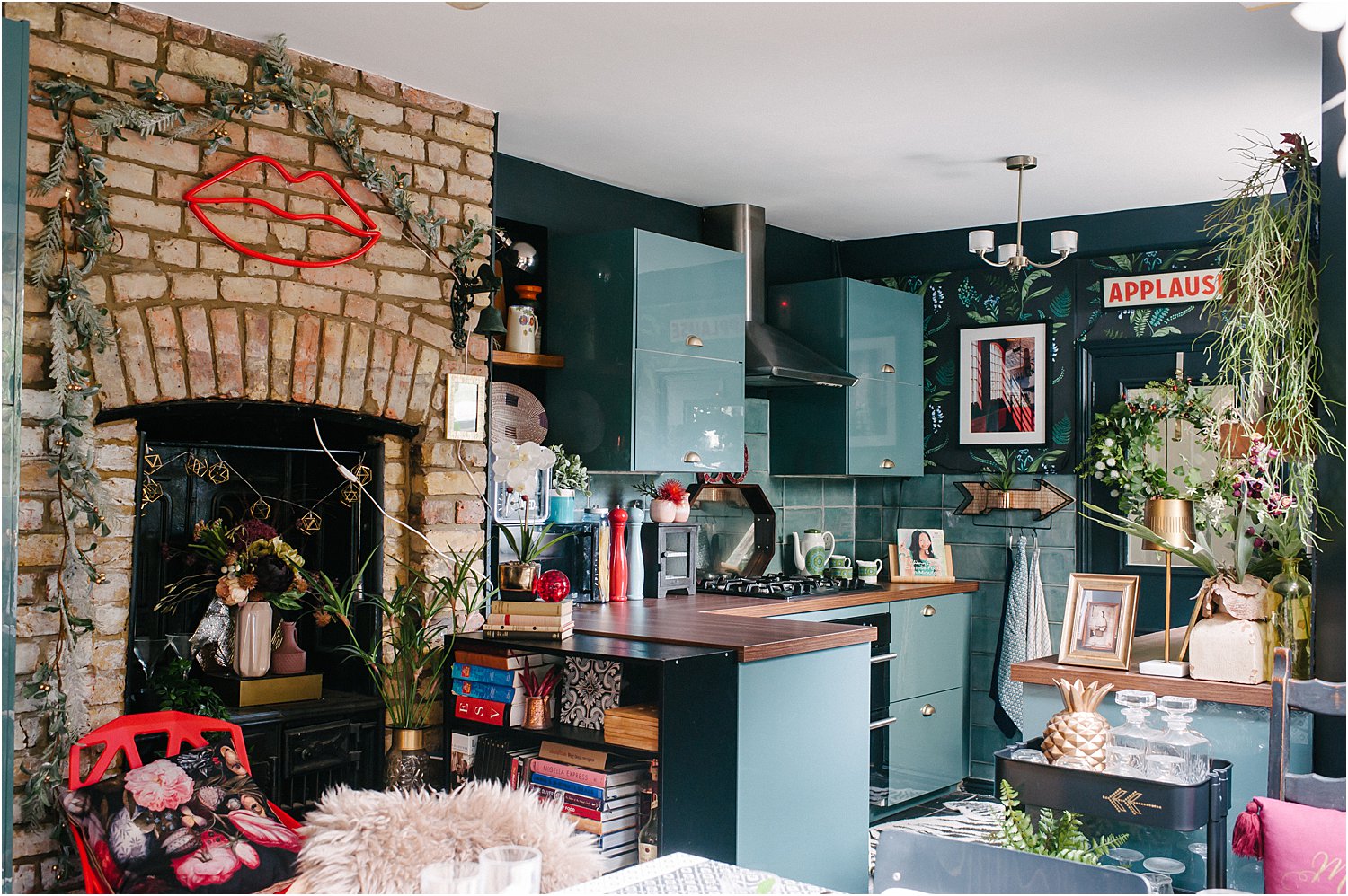
In my kitchen I decided that the units and tiles are going to be the main background with the wooden worktop as the main contrast. The stars are the accessories that I wanted to stand out – wallpaper and plants and some red touches like the applause light and the red photograph.
3. Textures
I never really understood what these were before let alone how effective textures are. But they add a depth and richness to a space that nothing else can, in my opinion, not even colour.
Textures come in many forms: accessories like plants and flowers, shiny utensils like copper, gold, silver, fittings like rustic shelves or glossy units,pictures on the wall like art paintings and prints, lighting – a boho macrame chandelier or crystal style, geometric cage light or Japanese paper. The more textures are at play in your kitchen, the more interesting the space will be.
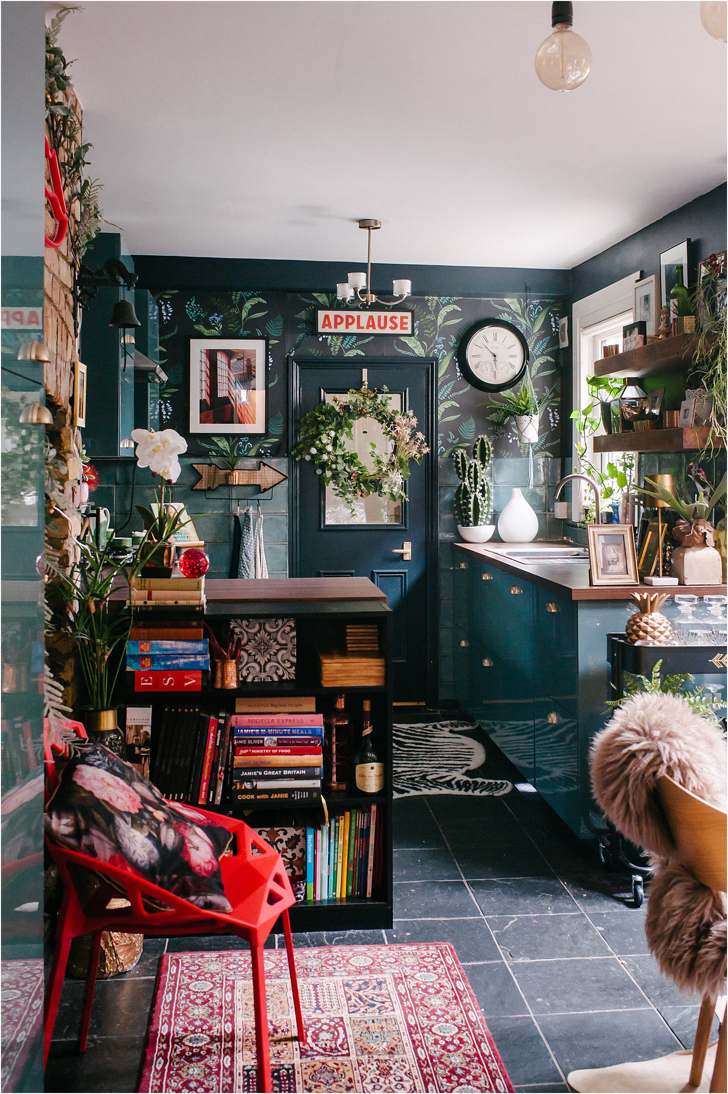
4. Pattern
Just like textures, patterns come in many forms. What I learnt was to use pattern as a contrasting element and therefore increase the chances of the eye travelling from one place of the kitchen to another. In my case, I limited my obvious use of pattern to the wallpaper and filled the rest of the areas with other textures and patterns that are not as pronounced.
People have commented that my kitchen looks tidy whilst being really full and maximal. If I may say so, I think giving my kitchen a large blue background (Farrow and Ball Railings on the walls which is a blue black colour, Ikea blue kitchen units and Leaf Tiles almost the same colour as the units) made it easier to keep it cohesive. Having reclaimed shelves in dark oak that are similar to the dark wooden worktop provided a strong and solid contrast. Both allowed me to fill them with greenery as the main accessories and stars of the show.
Don’t forget to download my free resources that will help you design your own interiors and grow your Instagram account!
I hope this article on 4 tips in designing a kitchen has helped give you ideas one way or another as you think about making changes to your own kitchen. Do share your thoughts on Instagram layered.home and I’d love it if you would follow me on there too! And please share on your stories or repost on Instagram, I’d be forever grateful!