3 tips on Photographing interiors with mixed lighting
Photographing interiors with various lighting types is usually an issue for many so much so that the rule is to turn all the lights off and only use natural light whether that be window or skylight as long as it’s daylight.
The trouble is that half the time there isn’t enough light or not all of us have cameras that can handle low light or long exposures without the need for extra equipment like a tripod for example. And what about the trend that is neon? All that money spent on neon to only turn it off instead of showing it off! What about photographing interiors in the evening where there is no daylight anymore? You want to retain the ambience of the space and not overpower it with flash that kills the very mood you want to capture.
I have already written an article on how I photograph my interiors with mixed lighting in terms of lighting, camera settings and what to do with the rules. Read it here. By the way, don’t forget to download my free resources that will help you design your own interiors and grow your Instagram account!
But I also want to add 2 things to note and get right:
1. White balance
Make sure that white looks white in any light if it should look white. If you are shooting in the evening with tungsten lighting, you use the tungsten white balance setting or your image looks too yellow so that the whites looks yellow too, or worse orange when in reality it doesn’t look like that. It’s ok for whites to look warm in warm light but not ok for it to look yellow or orange.
Similarly, in cool light, early morning daylight or blue light, you want white to look white and not with blue or purple tints. I have seen brides dressed in blue where the photographer ignored the white balance and the white dress was looking very blue!
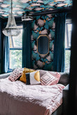
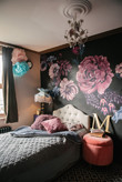
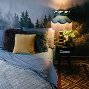
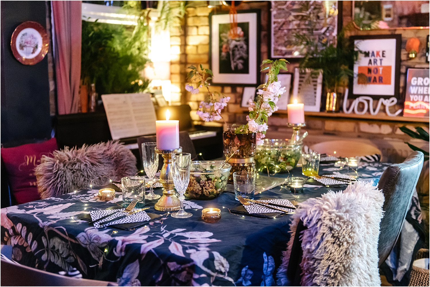
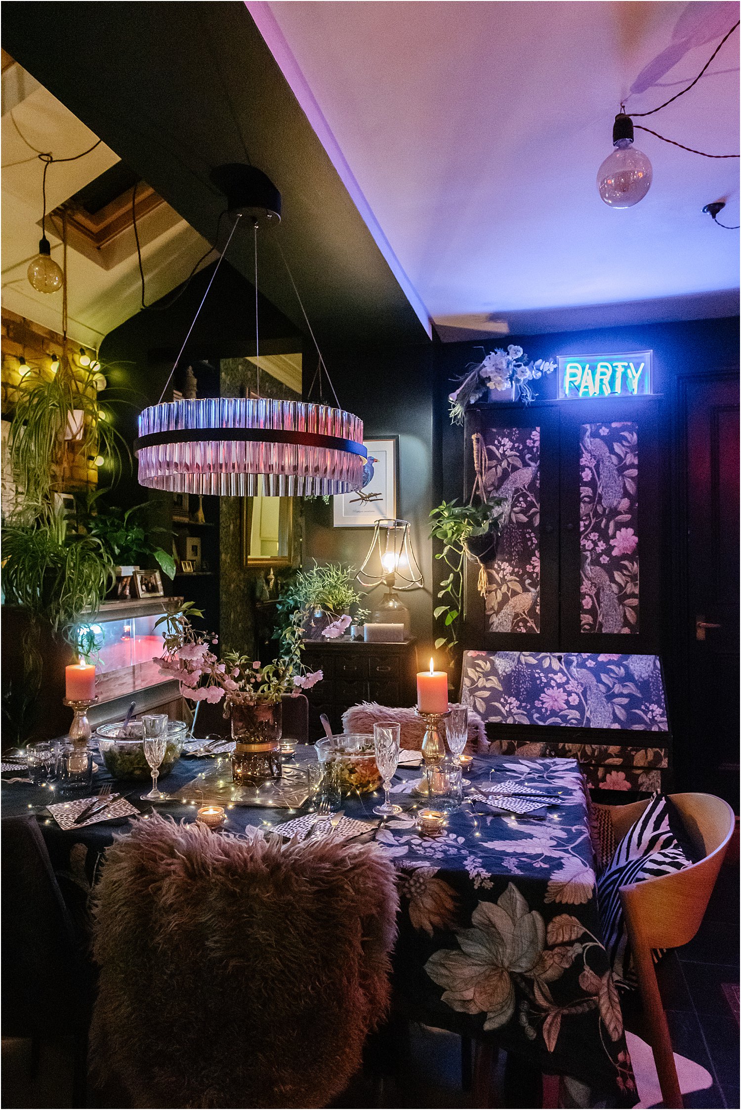
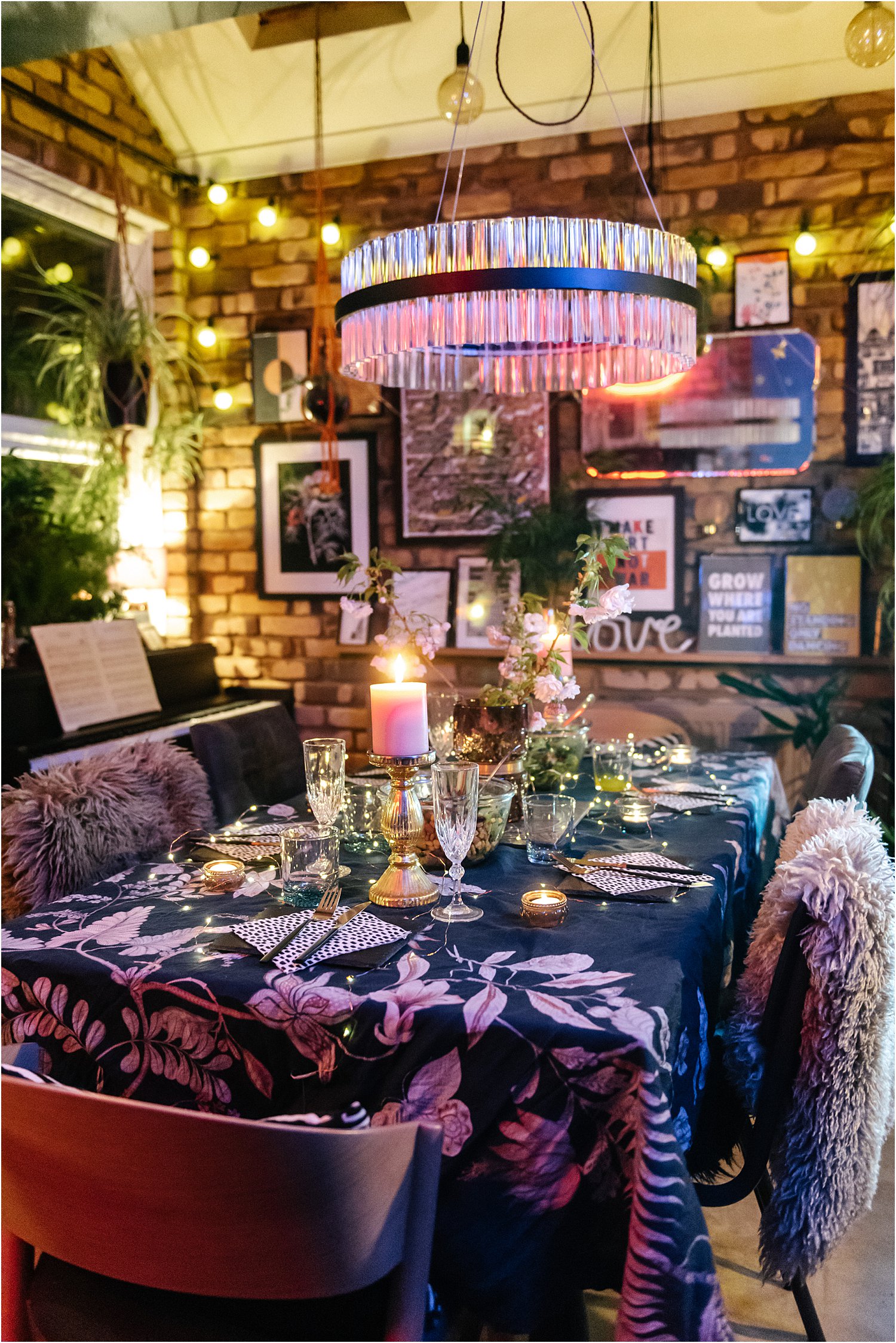
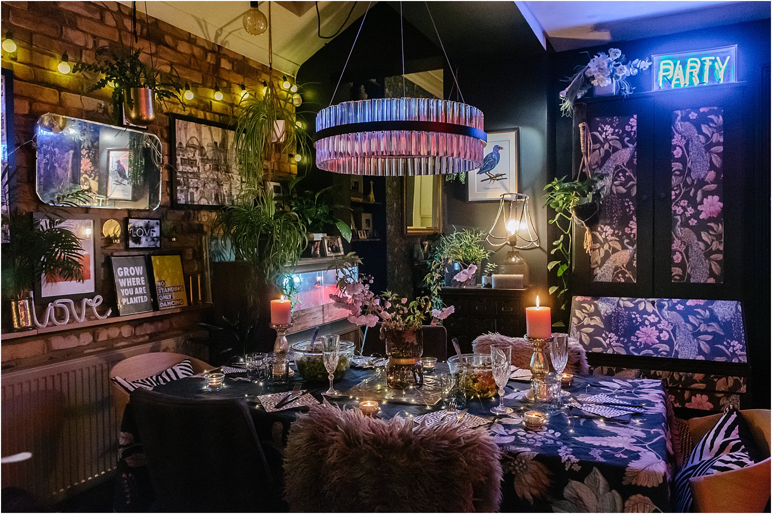
In extreme lighting situations, there could be a tinge of coloured light on your items but if that is what it looks in reality, then I’d say that is acceptable. An example is the ceiling here which is lit by the blue neon so it has a blue tinge. In the same manner, the ceiling in the photo below is lit by the festoon and other incandescent light in the area. But you can see that the posters on the wall still look fairly white. Colour cast is really tricky to avoid but it’s possible to tone them down or get rid of them completely. Stick as close to what your eye sees would be my advice. Some images are lit creatively and intentionally using various coloured gels on lights for a particular effect.
2. Contrast
This has to do with the difference between black and white. I see many who make their shadowed and darker areas solid black that you cannot see the detail in them. Wooden textures are so over-edited that the grain in the wood looks too dark, and the wood ends up looking so streaky with all natural look and feel of the wooden texture lost in the extreme editing.
In the same manner, whites are so over-edited that the light areas are now blown out patches of white and you can no longer see the item let alone the details of the item. I have seen this many times in walls, sheepskins, light linen and white accessories. I assume they are done for maximum impact – that is, a scroll-stopping contrast. But you don’t need to go that far! For one, it doesn’t look anywhere near real life. And secondly, you lose details.
3. Filters
If and when using filters, use them at weak strengths. Filters usually add an unnatural tinge to the image and some extreme filters mess with the black points making them grey. Start by using them between 10% – 30% and you will find that usually that is enough. You want the photo enhanced, not obliterated. I prefer not using filters but sometimes when I cannot get the feel I want, especially that warm and cosy feel, I turn to them but only use them as an enhancing touch.
Beware of filters that strip the colours off your image or make them dull so that, for example, a verdant green becomes a dull green or natural warm wood looks like steel. Again, if you want to use these ones, use them gently. I see so many images that looks steely grey even if the material is supposed to be warm because of the overuse of such filters. You could say ‘to each his own’ and it’s what one prefers. Fair enough. Just be gentle rather than heavy-handed with them. I would always err on the side of natural rather than overdone.
I hope you found this article on 3 tips on Photographing interiors with mixed lighting useful.
If you want to take better Instagram photos, I have written an article in more depth about it here including side-by-side comparisons of the use of filters. Don’t forget to download my free resources that will help you design your own interiors and grow your Instagram account!
Do share your thoughts on Instagram layered.home and I’d love it if you would follow me on there too! And please share on your stories or repost on Instagram, I’d be forever grateful!